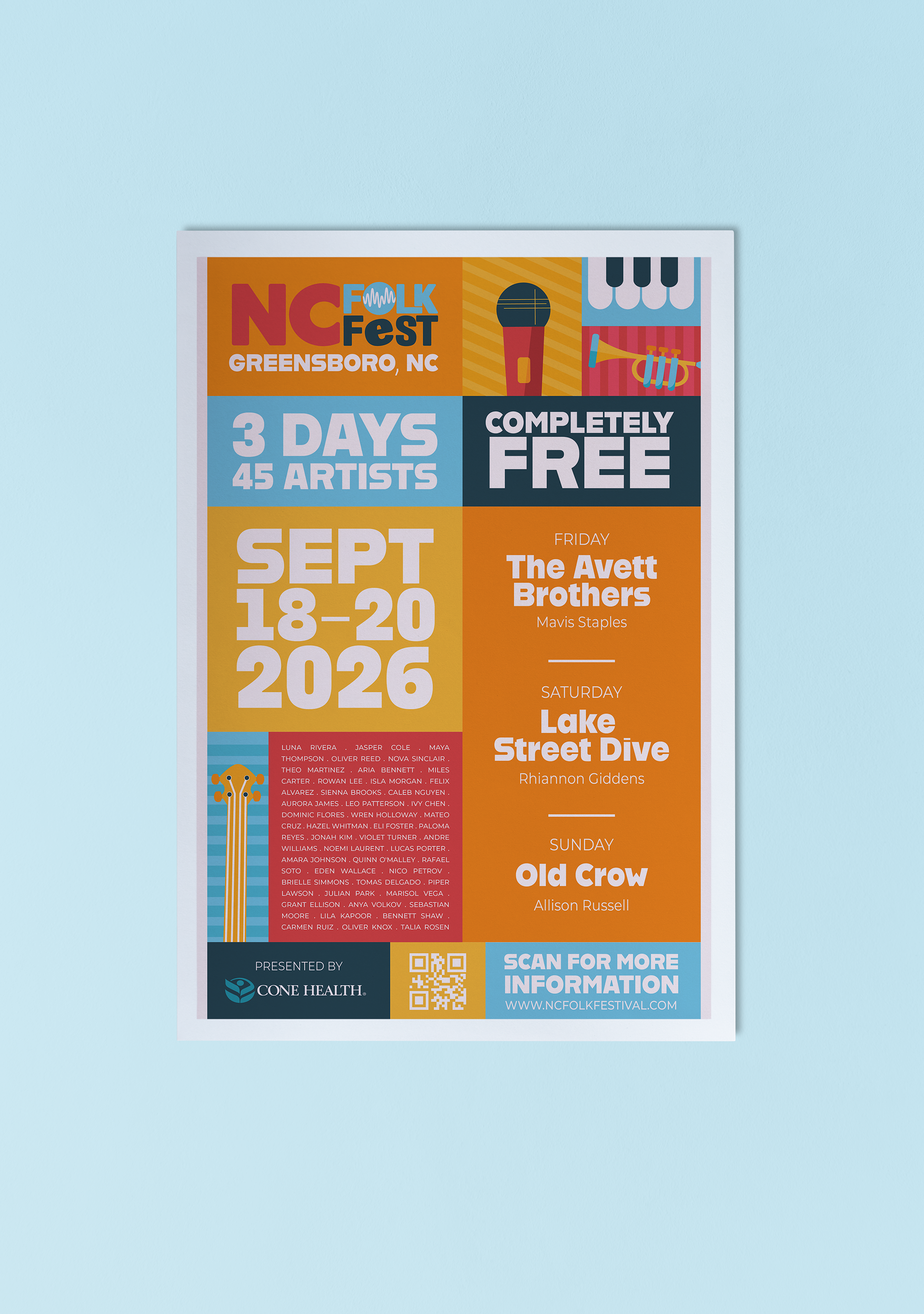
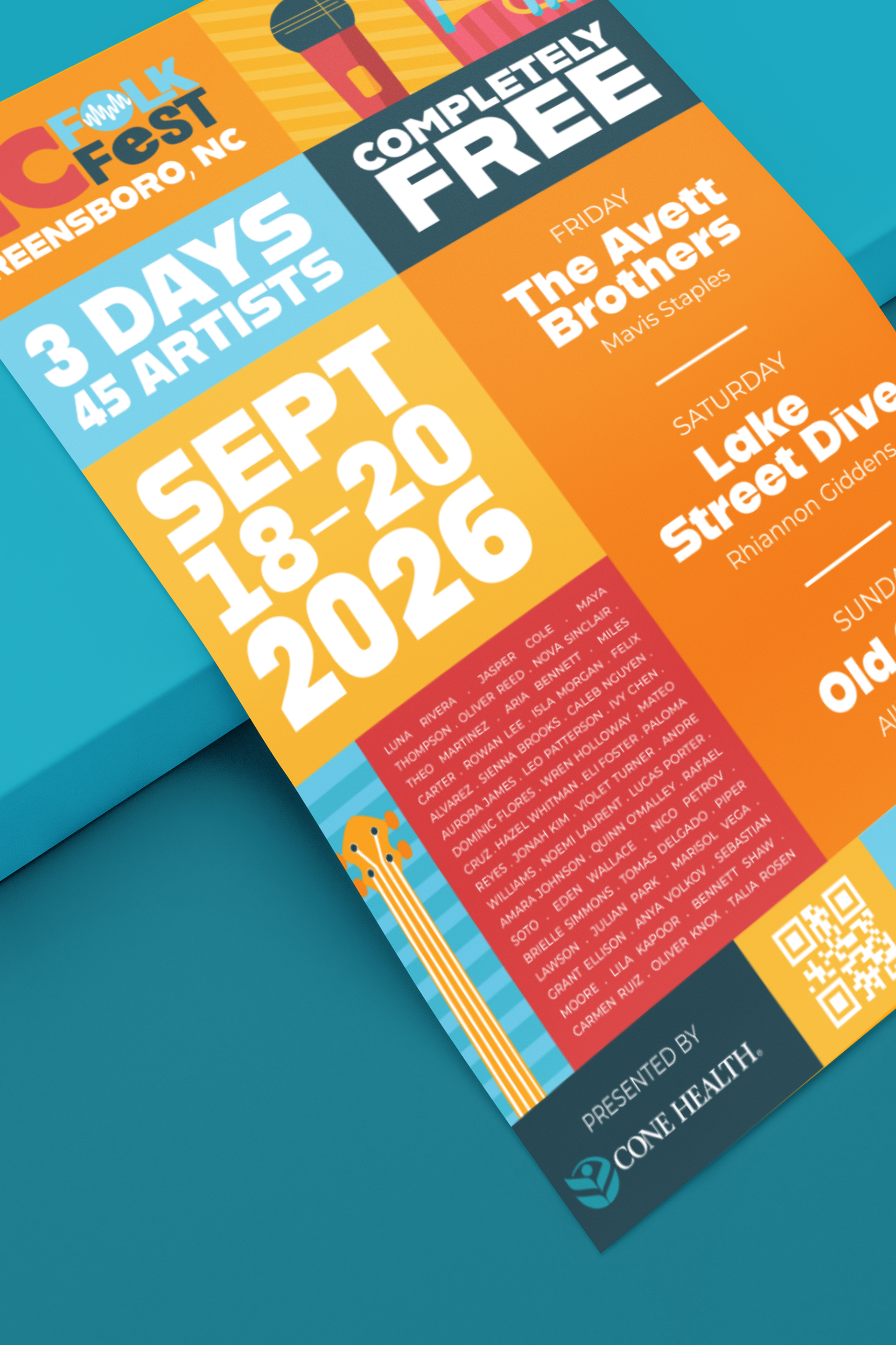
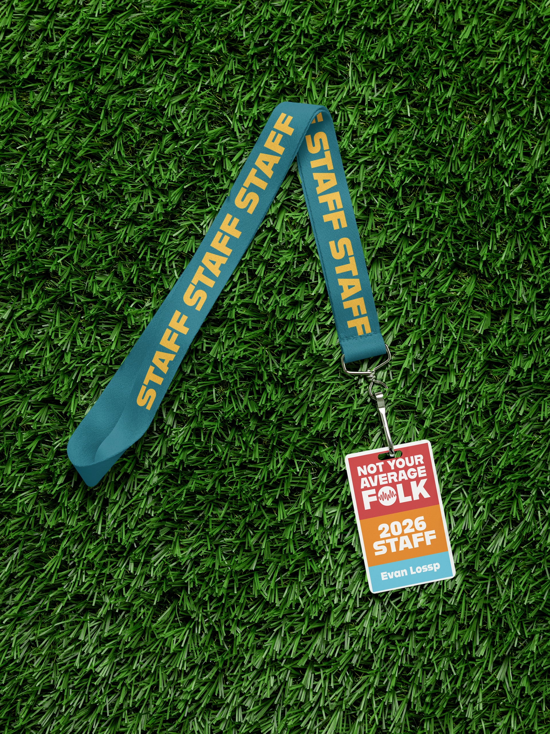
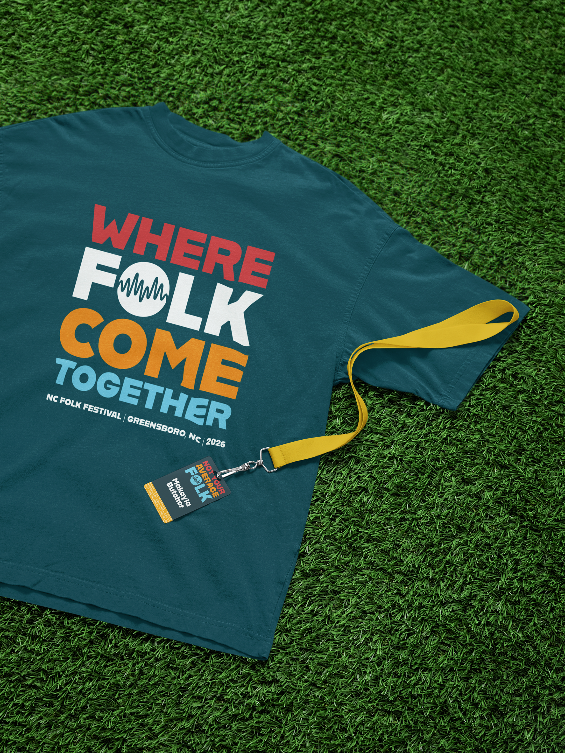
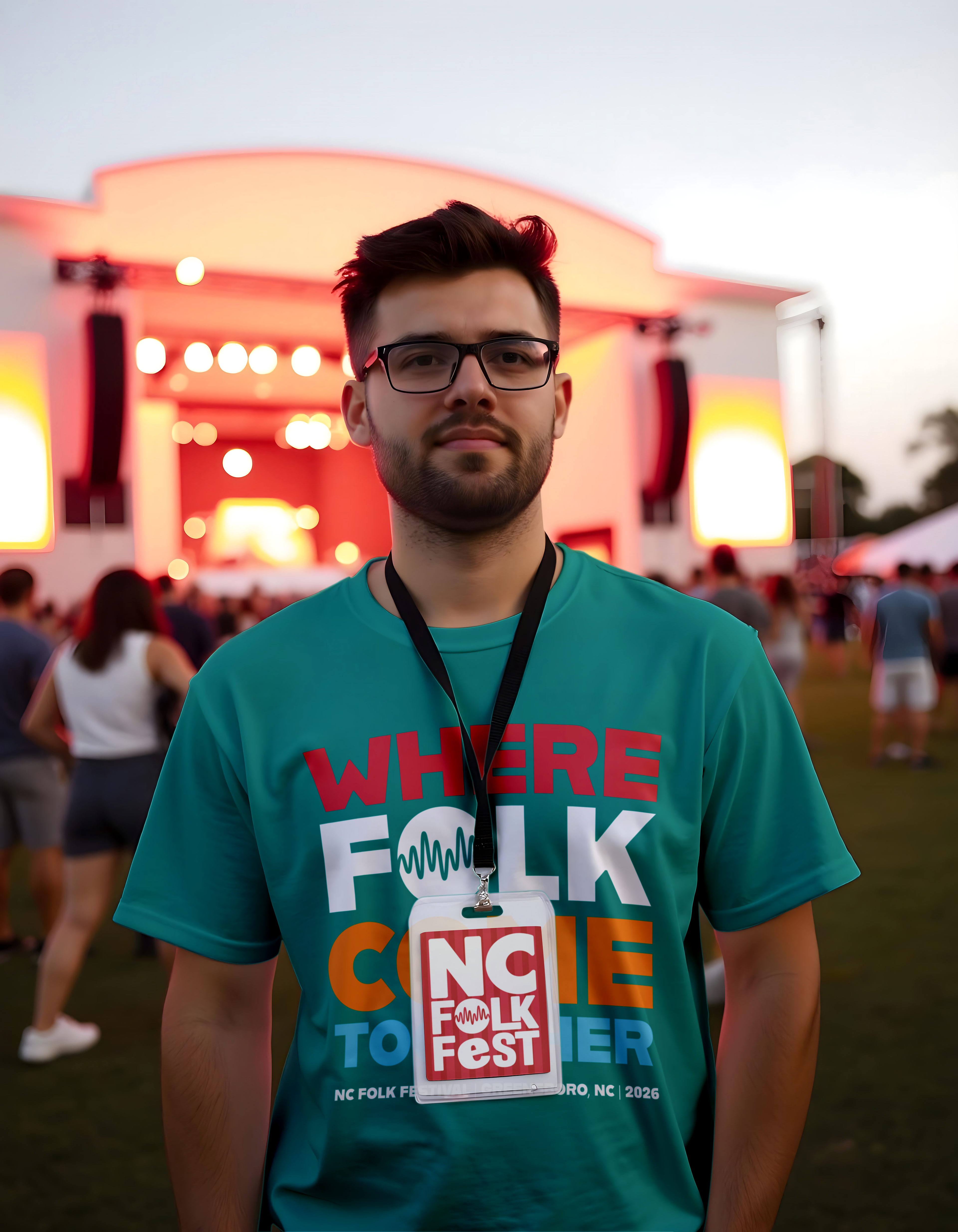
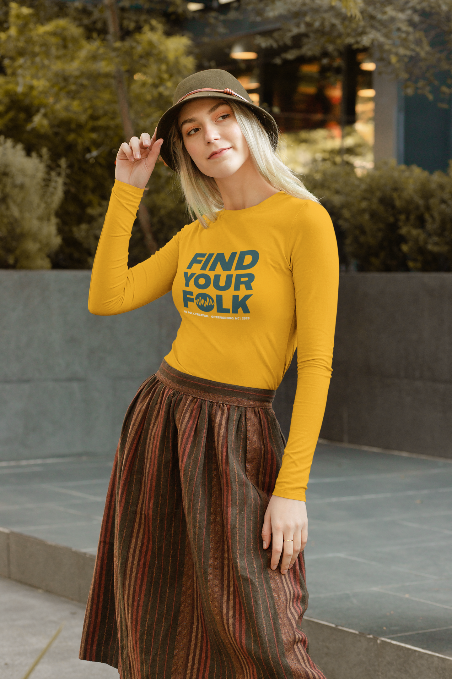
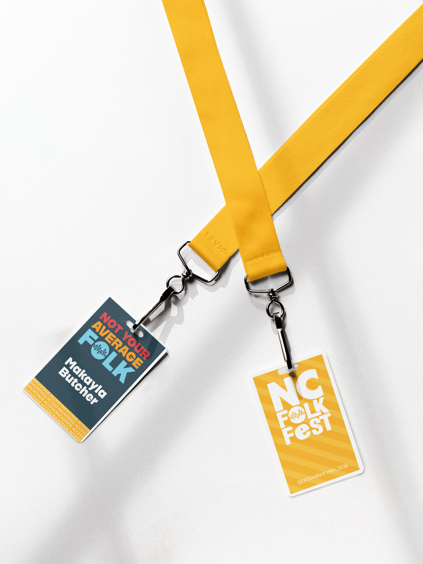
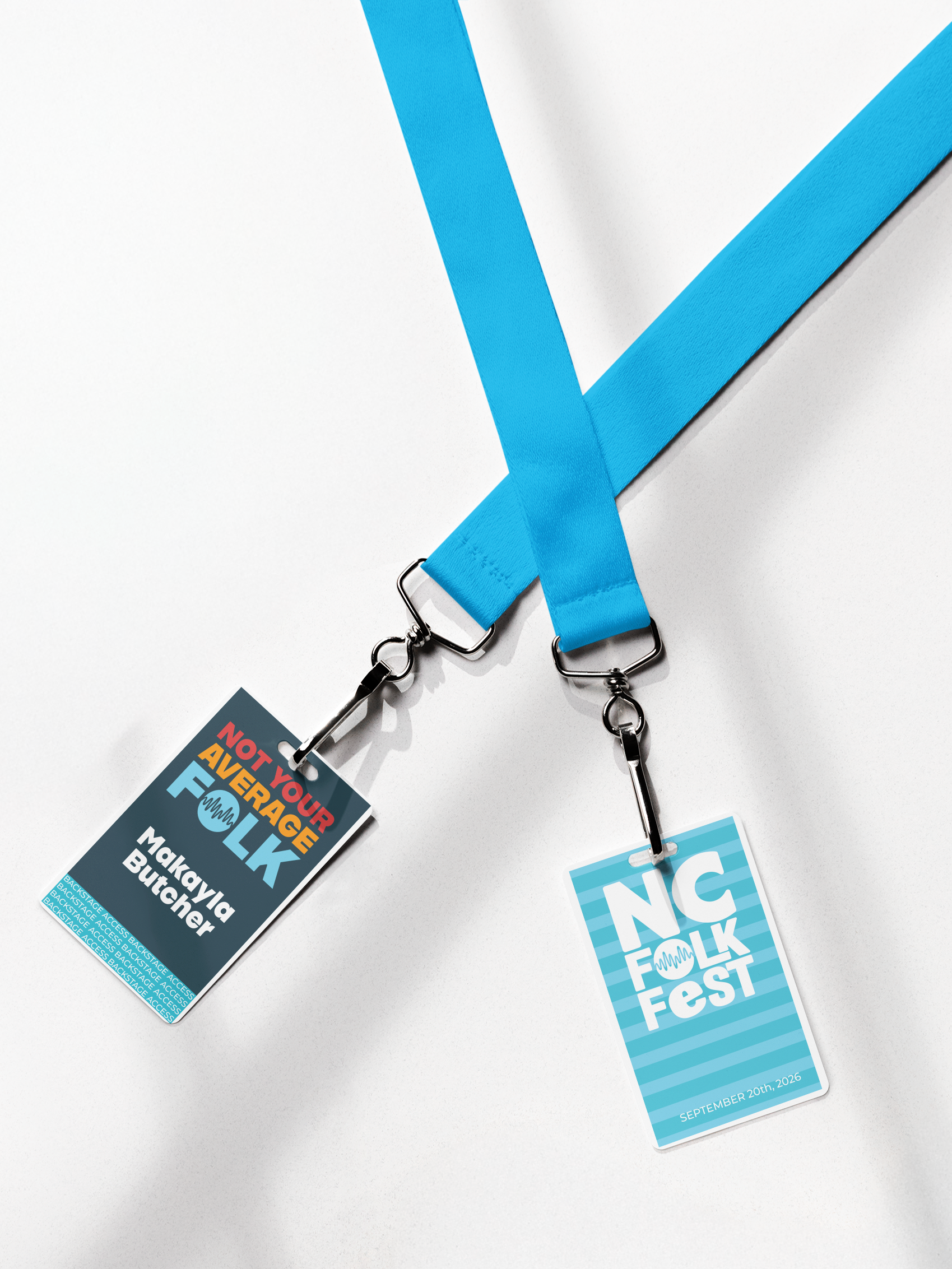
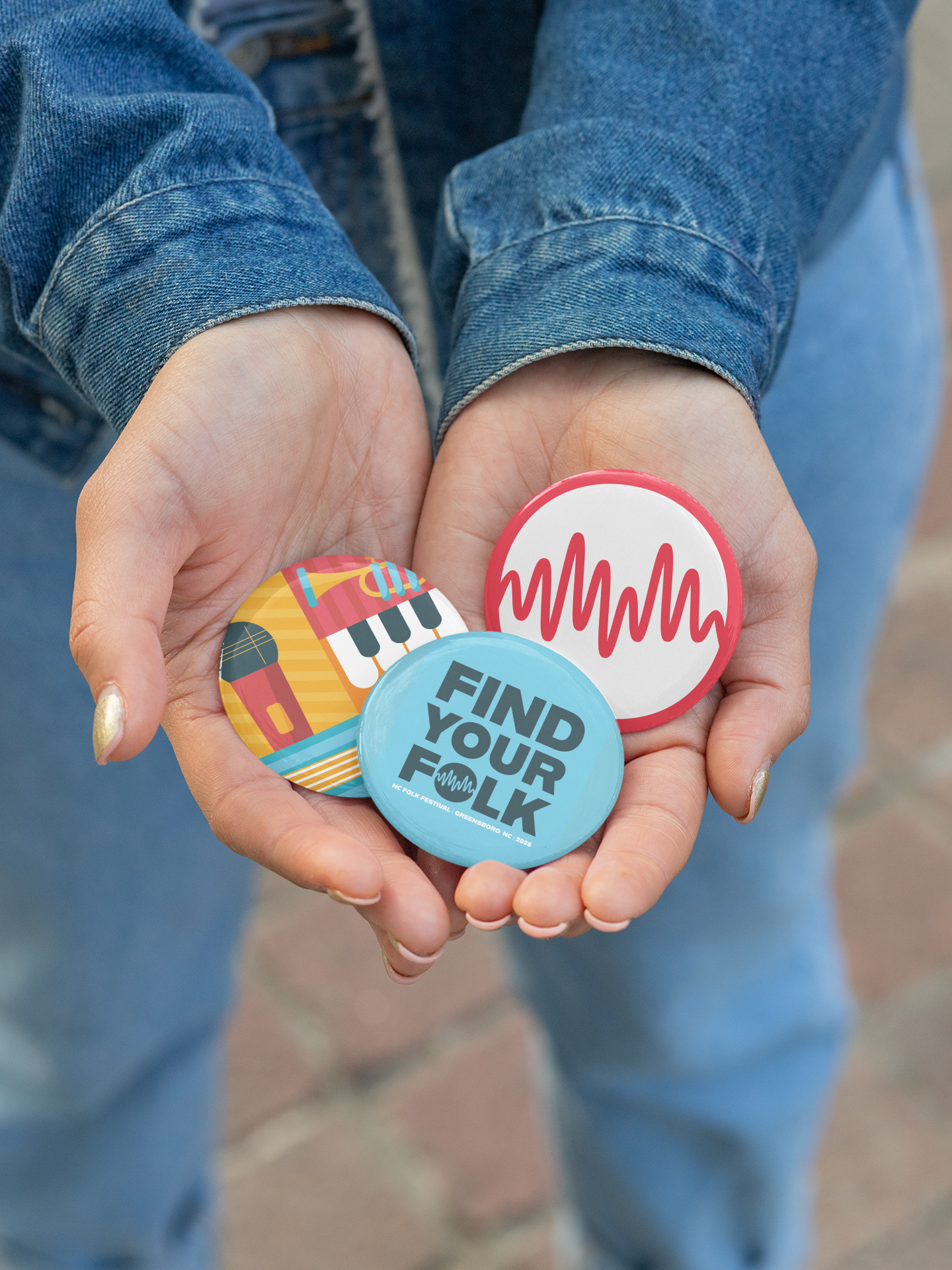
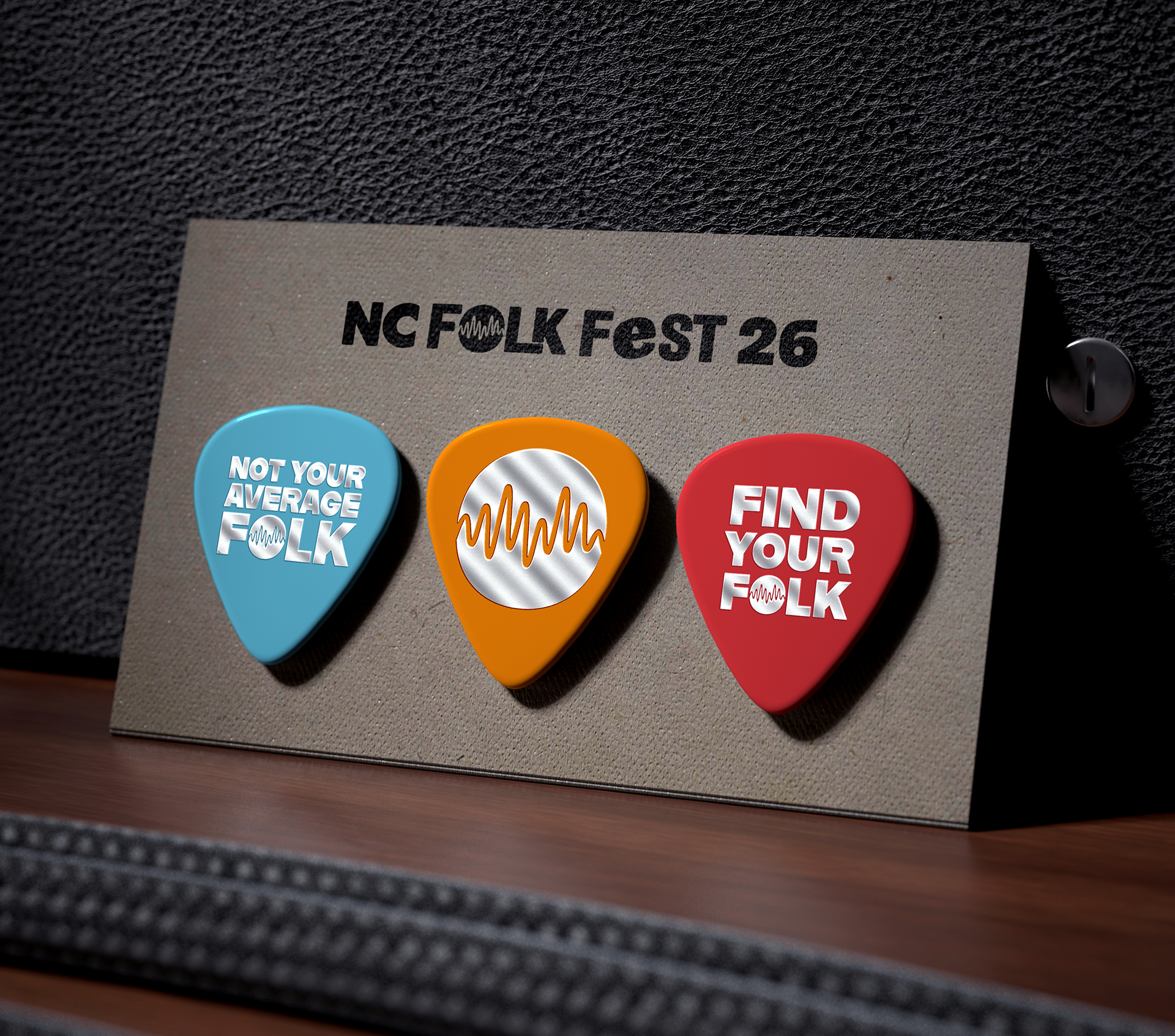
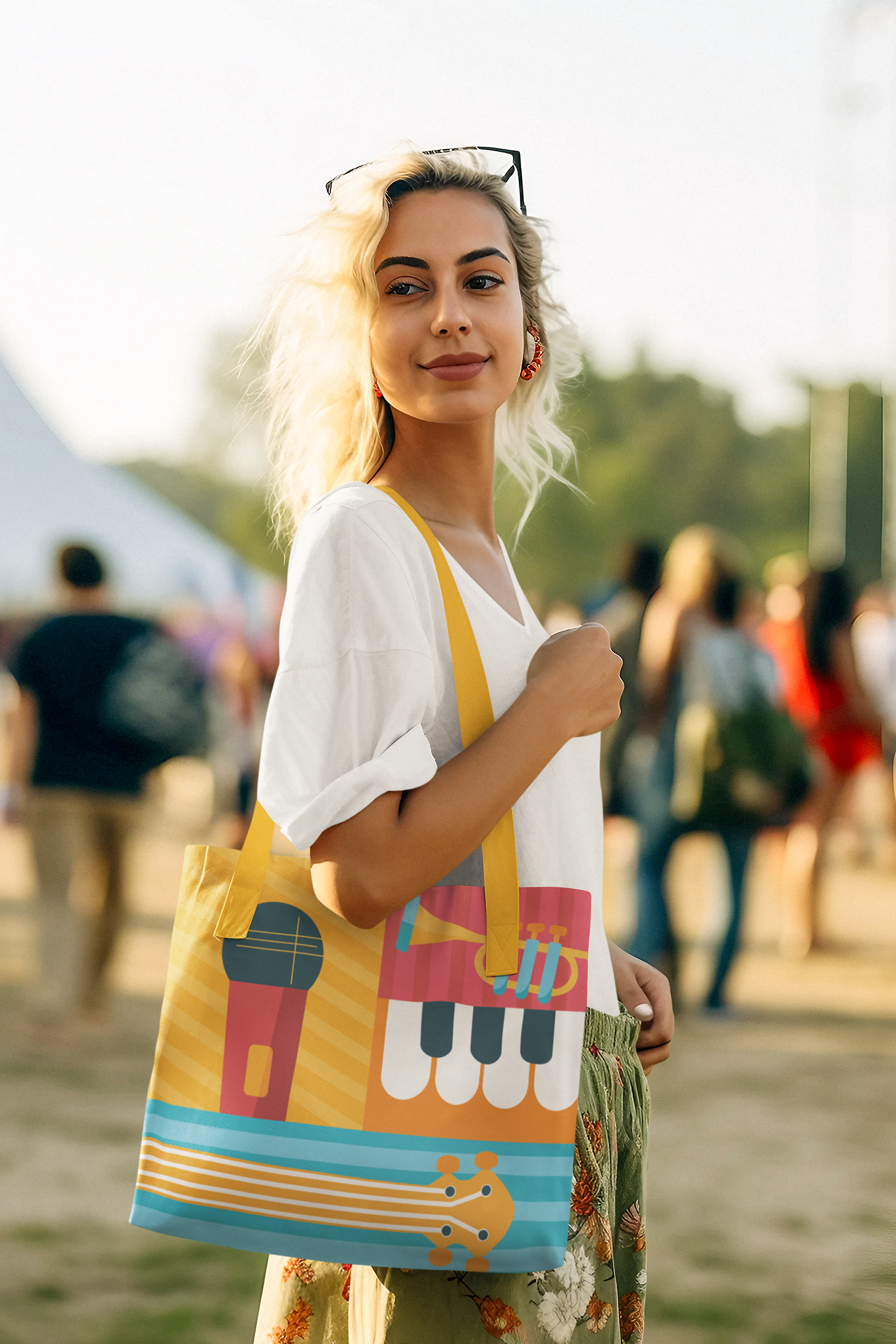

For this project, I designed an original 11″×17″ poster and a supporting suite of promotional mockups for the North Carolina Folk Festival. The goal was to create artwork that reflects the festival’s energy, mission, and community focused spirit while remaining flexible enough to function across print, merchandise, and digital applications. Rather than centering the design around a single genre or performer, I focused on capturing the overall vibe of the festival. The NC Folk Festival is layered, vibrant, and immersive, with multiple stages, sounds, and stories happening at once. This concept is reflected through bold typography, repetition, and a dense visual rhythm that mirrors the experience of moving through the festival grounds. The poster builds directly from the festival’s existing visual identity, using a recognizable color palette and graphic language to create immediate association with the brand. Key information such as the festival name, dates, and location are clearly prioritized, while space is intentionally reserved for performer names to be added later. This approach ensures the design remains adaptable and functional for future updates without losing its visual impact. To demonstrate scalability and real world application, the design was extended into a cohesive promotional system including posters, buttons, lanyards, tote bags, guitar picks, and additional branded materials. Each mockup was selected to reflect items commonly found at music festivals and to show how the artwork could live beyond a single poster. These applications reinforce the idea of the festival as something attendees can carry, wear, and revisit over time, strengthening both brand recognition and emotional connection. Together, the poster and mockups present a unified visual system that celebrates community, music, and tradition while supporting the NC Folk Festival’s identity across multiple platforms.